.png)
Unit 8 - Assignment for CIS 4041 - Madison Lindquist
I wanted to set up the primary navigation along the top with clear and concise categories to save space. This primary navigation will be set up as a vertical dropdown menu. When the user hovers over one of the main categories listed, a menu with subcategories will appear. Since there will be anywhere from 2-9 sections of content, the vertical dropdown menu seemed appropriate and wont make the interface feel too overwhelming for the user. To prevent against human error, I plan to add a delay to the hiding of the dropdown (200-300 ms) and make the area for each list item wider.
On the main landing page, I also plan to include a fading slideshow on the top banner of the site to display the company's services. This feature draws the attention of the user and sets the stage for the quality of services provided. I plan to transition between three different images so that it is not too overwhelming for the user and the transition will be set up to flow smoothly from one image to another.
Below that, I included a card design feature which shows the three main service categories (hardscape, landscape, and other services. The user is given the ability to click on which service they are interested in. This provides an alternative navigation for the customer. While this does the same thing as the primary navigation, it is appealing and can reduce the number of clicks for the customer to get to where they want to be. It also provides information to the customer with out overloading the page with detailed information that can distract from the purpose of the site.
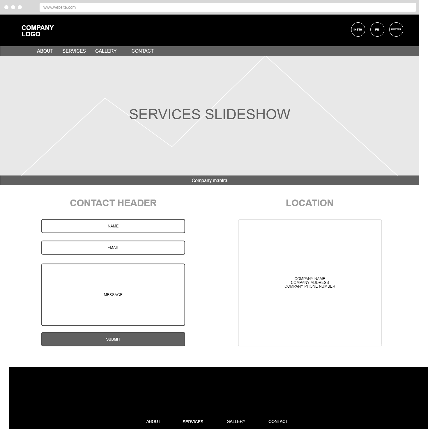
As you can see the primary navigation and banner are carried throughout the site for consistency. I decided against using the breadcrumb feature since the site will not contain the amount of content required for a breadcrumb and there is not a huge benefit in doing so.
I wanted to keep the "Contact Us" page as simple and to-the-point as possible. I wanted to include a form design feature for users to get in contact the company via the website, if they prefer. I only wanted to gather the necessary information because filling out forms can be frustrating for the user to begin with. However, for those users who prefer to contact the company directly, I wanted to make the contact information easy accessable as well. That information you can find directly to the right of the contact form.